







Creating a calm and peaceful atmosphere in your home starts with the colors you choose. Colors have a powerful impact on our moods and can influence how relaxed or energized we feel in a space. If you’re looking to design a soothing environment, selecting calm colors is a great place to start. Whether you’re painting walls, picking furniture, or adding accents, the right hues can make a big difference.
In this guide, we’ll share helpful tips for choosing calm colors for your home, along with ideas on how to use them effectively.
Why Choose Calm Colors?
Calm colors are typically soft, muted, and easy on the eyes. They encourage relaxation and can reduce feelings of stress or anxiety. These shades work well in bedrooms, living rooms, or any space where you want to unwind and recharge. Calm colors help create a balanced environment that feels inviting and comfortable.
Popular Calm Color Families
Here are some popular color families known for their calming qualities:
– Blues: Soft blues, like sky blue or pale aqua, evoke the tranquility of water and sky.
– Greens: Light greens and sage tones bring a sense of nature and freshness indoors.
– Neutrals: Warm beiges, soft grays, and creamy whites provide a gentle, understated backdrop.
– Lavenders: Muted purples and lilacs can add a subtle touch of calm elegance.
– Soft Pinks: Pale blush tones offer warmth without overwhelming the senses.
Tips for Choosing Calm Colors
1. Consider Your Room’s Purpose
Think about how you want the room to feel and be used. Bedrooms benefit from cooling colors like soft blues or gentle greens to promote rest. Living rooms might use warm neutrals or pastel shades for a cozy yet serene vibe. Kitchens can still be calm but might use slightly brighter hues to encourage energy and appetite.
2. Test Samples in Natural Light
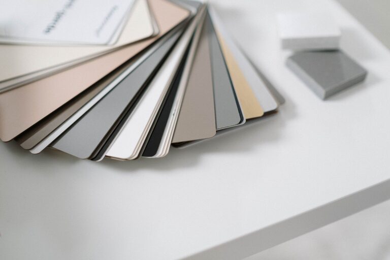
Color looks different under various lighting conditions. Paint small patches of your chosen colors on the walls and observe how they look throughout the day. Morning sunlight, afternoon shade, and artificial lighting can all affect the color’s appearance.
3. Use a Monochromatic Palette
Sticking to different shades of the same calm color can create a harmonious, peaceful effect. For example, layering light, medium, and darker blues can add depth without overwhelming the senses.
4. Balance with Neutral Accents
Pair calm colors with neutrals like white, beige, or gray to keep the space feeling open and fresh. Neutral tones provide a perfect canvas that highlights the calming colors without competing with them.
5. Opt for Matte or Satin Finishes
Glossy paints reflect more light and can feel more stimulating. Matte or satin finishes have a soft, muted quality that enhances calmness.
How to Incorporate Calm Colors in Your Home
Walls and Ceilings
Painting walls in calm colors is the most straightforward way to set a peaceful tone. Consider light pastel shades or neutral colors for the majority of your walls. The ceiling can be painted a very pale version of the wall color or kept white to maintain openness.
Furniture and Upholstery
Choose upholstered furniture in subtle colors like soft gray, muted green, or warm beige. These hues blend well with most calm wall colors and create a relaxing seating area.
Textiles and Accessories
Add serenity with calming-colored pillows, throws, rugs, and curtains. These are easy to change seasonally or update when you want a new look.
Artwork and Decor
Select artwork that features soft, soothing colors or landscapes. Decorative items in calming hues complement the overall palette without creating visual clutter.
Avoiding Common Mistakes
– Too much contrast: Stark contrasts can feel jarring instead of calm. Aim for smooth transitions between colors.
– Ignoring undertones: Some colors may have warm or cool undertones. Pay attention to these for a balanced look.
– Overusing dark colors: While deep blues or greens can be calming, too much darkness might make a room feel smaller or heavy.
– Neglecting personal preference: Calm colors should also make you feel comfortable. Choose shades that resonate with you personally.
Final Thoughts
Choosing calm colors for your home is a wonderful way to create a peaceful retreat where you can relax and recharge. By considering the purpose of each room, testing your color choices in different lights, and balancing hues thoughtfully, you can design a space that feels both soothing and stylish. Remember, calm colors don’t have to be dull—they can add warmth, depth, and a sense of harmony to your home.
Take your time exploring color options and trust your instincts. Your ideal calm color palette is out there, ready to transform your living space into the comforting haven you deserve.